


Your website has three seconds to prove it deserves a visitor’s time. Most don’t get a fourth. A slow load, a confusing menu, a pop-up blocking the exit button – any one of these sends people back to Google before they’ve read a word of what you offer.
Bad UX isn’t one big failure. It’s a stack of small ones: slow pages, broken website navigation, cluttered layouts, forms nobody wants to fill out. Fix these eleven, and you’re not just making the site “nicer to use.” You’re cutting the number of people who leave before they buy, book, or call.
Why User Experience Matters in Web Design
Google’s own bounce-rate research found that as load time moves from one second to three, the chance of a visitor bouncing jumps 32%. Push it to ten seconds, and the bounce probability rises 123%. Search rankings follow the same curve because Google treats user behavior as a quality signal.
A site that frustrates people ranks worse. It also sells less, and most businesses have the priority backwards. They spend on ads to bring people to the site, then lose them the moment they arrive. UX isn’t decoration. It’s not a design team’s pet project either. It’s the mechanism that decides whether marketing spend turns into revenue or just traffic that bounces without converting.
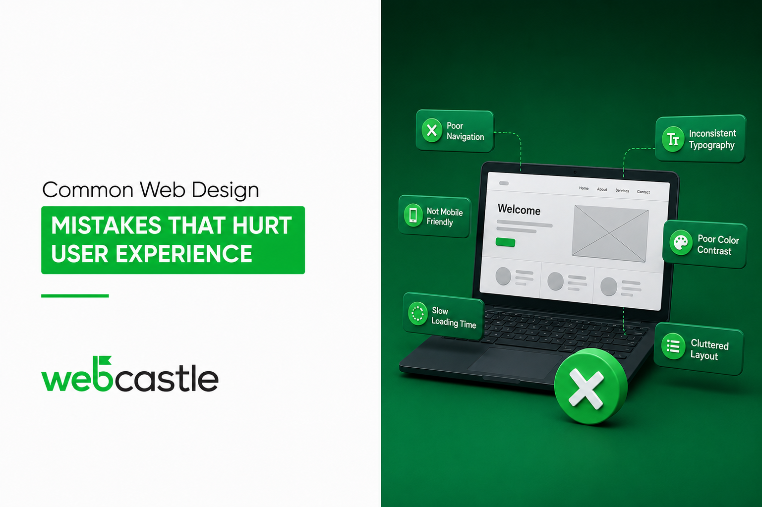
Common Web Design Mistakes That Hurt User Experience
Slow Loading Speed
Every extra second of load time costs conversions. Unoptimized images and bloated scripts are almost always the culprit.
Poor Mobile Responsiveness
Mobile traffic makes up roughly 60% of web visits worldwide. Build for desktop only, and you’ve written off most of your audience before they even land.
Confusing Navigation Structure
Can’t find what you came for in two clicks? Neither can your visitors, and they won’t stick around to try a third. Menus with more than seven top-level items are usually a sign that nobody ever sat down and planned the site’s structure. It just grew, one addition at a time.
Cluttered Layout and Excessive Visual Elements
More banners, sliders, and widgets don’t buy you more engagement. They give a visitor a dozen places to leave before they ever reach your actual offer.
Weak or Missing Call-to-Action
A CTA that’s vague, buried, or missing entirely leaves an interested visitor standing at a dead end. “Learn More” on every button isn’t a strategy. It’s a missed one every single time.
Poor Readability
Tiny fonts, low-contrast text, cramped line spacing. You’re asking people to work harder to read your page than most of them are willing to.
Inconsistent Branding and Design
Different fonts and colors on every page, and suddenly a solid business looks like it never finished the job.
Too Many Pop-ups and Intrusive Ads
Interrupt someone before they’ve read your page once, and you’ve trained them to leave the second the next one appears.
Unoptimized Images and Media
Large, uncompressed files are one of the biggest hidden causes of slow load times, and one of the easiest to fix.
Lack of Accessibility Features
No alt text, no keyboard navigation, and no captions. This locks out users with disabilities, and it costs you in SEO too.
Complex or Lengthy Forms
Every extra field is one more reason to abandon. Ask for what you need. Nothing else.
Best Practices to Improve User Experience
- Prioritize Mobile-First Design: Build for the smallest screen first, then scale up.
- Improve Website Performance: Compress images, minimize scripts, use a content delivery network.
- Keep Navigation Simple and Intuitive: A clear menu with obvious labels beats a clever one, every time.
- Use Clear Visual Hierarchy: Guide the eye with size, spacing, and contrast.
- Regularly Test and Optimize: UX isn’t a one-time fix. Run website usability tests and act on what they tell you.
Benefits of a User-Friendly Website
A site built around usability doesn’t just look better. It converts more visitors, keeps them longer, and earns repeat traffic instead of one-time visits that never come back. Lower bounce rates and higher engagement feed straight into search visibility too, since responsive web design, user experience design, and fast load times are baseline ranking factors now, not bonus points.
There’s a compounding effect on top of that. An easy-to-use site gets shared and linked more often, which builds authority over time without spending a dirham more on acquisition. Adopt UX best practices once, and it pays out on every visit that follows.
WebCastle Technologies works with businesses across the UAE to rebuild websites around actual user behavior. Want a straight assessment of where your site is losing people? Get in touch with WebCastle Technologies, a web designing company in Dubai, and find out what’s fixable this month.
Conclusion
Most of these web design mistakes aren’t hard to fix. What’s hard is spotting them on your own site when you’re too close to it to see straight. If your website is losing visitors to slow loads, confusing menus, or forms nobody finishes, that’s a UX problem with a clear fix.